How We Helped a Client Build a Power BI Dashboard for Multiple Projects in Saudi Arabia
Delivering multiple projects at the same time is never easy, especially when each one is running in a different location, handled by different teams, and using different reporting tools. This was the exact challenge one of our clients in Saudi Arabia was facing. Their portfolio included around ten active projects spread across the country. Every week and month, planners and engineers had to manually gather progress reports, cost data, and schedule updates from different sources, often in Word or Excel files.
The reporting process was slow, disconnected, and time-consuming. There was no unified view that could show the status of all projects together, which made it harder for senior management to take quick, confident decisions. Team coordination during review meetings was also difficult, each project was speaking a different reporting language.
Ready to take your skills to the next level? 🚀 Check out our Special Online Courses! 🚀
Gain valuable insights, boost your career, and learn from industry experts.
They needed a clear solution: a centralized Power BI dashboard for multiple projects that would bring all the data into one place, clean, simple, and interactive.

The Challenge
Before reaching out to us, the client was managing around ten active projects at the same time, each located in a different region across Saudi Arabia. The teams were using separate tools and formats to prepare their reports, some in Word, others in Excel.

This lack of consistency made it difficult to get a full picture of what was happening across the portfolio. Every week and month, engineers would spend long hours collecting and merging reports just to prepare for internal meetings.
There was no single place to view all project statuses. Important decisions were often delayed because the information was scattered and manually handled. During coordination meetings, it was hard to have productive discussions because every project team came with a different reporting style, and the data was never fully aligned.
It was clear that what they needed was a unified, automated solution, a Power BI Dashboard for multiple projects that would bring together all reporting into one clean, interactive platform that everyone could rely on.
How We Built the Power BI Dashboard for Multiple Projects — Step by Step
1. Receiving and Reviewing the Raw Data
The first thing we received from the client was a collection of raw data coming from about ten different projects. Each project had its own way of reporting, different Excel sheets, Word documents, PDF exports from scheduling software, and a mix of weekly and monthly reports. There was no common structure or format.

Our first challenge was to make sense of the chaos. We carefully examined every file, identified what data was useful (baseline dates, actual progress, cost entries), and documented what was missing or unclear. This phase was essential, before we could build anything in Power BI, we had to understand the shape and quality of the data we’d be working with.
2. Meetings to Understand the Real Needs
After reviewing the data, we arranged multiple online meetings with the client’s team. These sessions involved planners, project managers, and senior engineers, each with their own perspective on what the dashboard should deliver.

Power Bi Monitoring and Controlling with P6
Microsoft Power BI is very easy software. However, it is magically solved the slow performance of excel for large data, added new…
- 1,194 students
- WhatsApp support group
- Certificate
We didn’t just ask what visuals they wanted, we asked why. Why this KPI matters? Who’s going to use this view? What decisions are being delayed due to lack of clarity? And we gave them some recommendations based on our experience.
After deciding the wide lines of the dashboards and analyzing the projects data, we started to draw whats in our minds and discuss those drafts on papers.

3. Structuring the Data and Building the Power BI Model
Once the needs were clear, we started building the data model in Power BI. We created structured tables for planned values, actual progress, invoices, issues, submittals, and procurement data.
This wasn’t just a matter of importing Excel, we had to rebuild the data structure from scratch. We normalized data tables, linked project codes, and built relationships between schedules and site data. Every column, formula, and measure was designed to feed the future visuals with real meaning.

4. Internal Testing for Logic and Accuracy
Before showing anything to the client, we put the model under internal testing. We simulated reporting periods, applied different filters, and cross-checked our visuals against actual site reports.
In this phase, we caught hidden issues, like inconsistencies in naming conventions or missing relationships between data tables. We adjusted calculations, created backups, and ensured every number in the dashboard was trustworthy.
5. Client Review and Collaborative Feedback
With the first working version ready, we shared the dashboard with the client for live testing. Their feedback was valuable and direct. They helped us spot areas where the visuals needed to be simplified for non-technical users. Some KPIs needed to be added, and others reworded to match internal terminology.
6. Finalizing the Design and User Experience
After validating the content, we shifted our focus to visual clarity. We selected a consistent color palette, standardized font sizes, and ensured filters and slicers were logically placed across all 12 pages of the dashboard. We even did two versions of the whole dashboard with different themes and colors and gave the client two options to choose from.

The design wasn’t about making things “look nice”, it was about creating a user-friendly experience for engineers, project managers, and decision-makers alike. Whether someone needed to check a quick SPI figure or dive deep into a delay breakdown, the layout made everything easy to reach.


7. Final Testing and Documentation
We conducted full testing on the finalized dashboard using updated, real project data. Then we prepared documentation: a user manual explaining how the dashboard works, a guide for how to refresh the data weekly, and tips on how to troubleshoot issues.

This step ensured that even after our job was done, the dashboard could be maintained and used internally without delays or confusion.
8. Onsite Training in Saudi Arabia
To make the transition smooth, we flew to Saudi Arabia and conducted a 3-day intensive workshop with seven engineers from different departments.
The training started with Power BI basics, then gradually moved to building dashboards from scratch, and finally deep-dived into their actual reporting system. We made sure everyone understood how the dashboard works, how to update it, and how to even expand it in the future.
As a bonus, we gave all participants full access to our online course so they could revisit the material and explore more features at their own pace.

9. Ongoing Support and Long-Term Success
Even after training was complete, we didn’t disappear. We provided continuous technical support for a month, answering questions, helping solve new challenges, and ensuring that the client felt fully confident using their system. The feedback was excellent, and the dashboard is still in active use today, making reporting easier, meetings faster, and decisions more informed.
✅ If you want to save time, standardize reporting, and have full visibility across all your projects, click here to request your own custom reporting system. We’re ready to help.
Dashboard Detailed Breakdown
If you’re interested in exploring the dashboard system that we created for our client page by page and know how each page and visual works, stay tuned and a series of articles will be posted in the next weeks.
- A Tour of an Enterprise Power BI Dashboard [Multi-Project Power BI Dashboard]
- Engineering Power BI Dashboard [Multi-Project Power BI Dashboard]
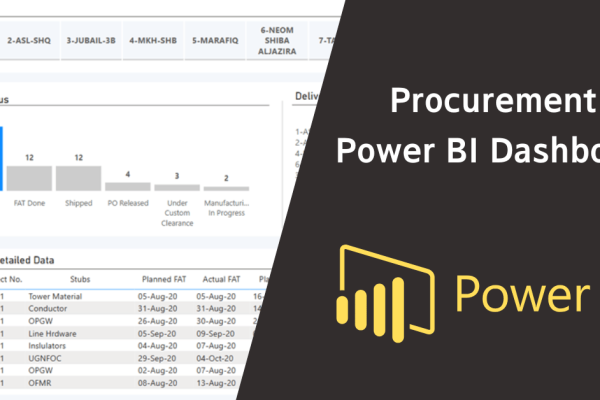
- Procurement Power BI Dashboard [Multi-Project Power BI Dashboard]
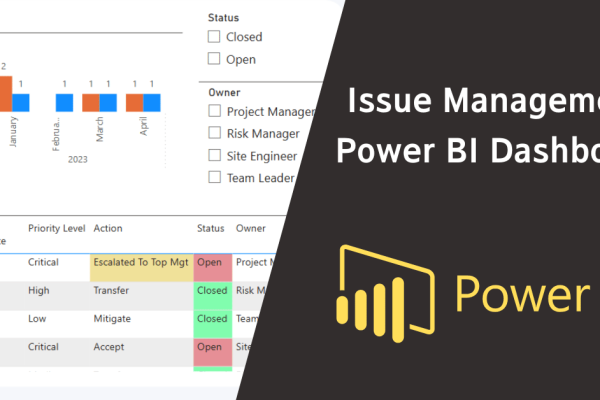
- Issue Management Power BI Dashboard [Multi-Project Power BI Dashboard]
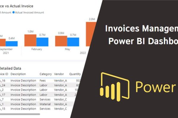
- Invoices Management Power BI Dashboard [Multi-Project Power BI Dashboard]
Keep in Touch
Join our Email Newsletters and receive FREE weekly useful content!

Keep growing with Planning Engineer
Learn with a clear path
From Primavera P6 basics to claims, cost control and Power BI. Start with our free courses.
Browse coursesGet help on WhatsApp
Every course comes with a private WhatsApp support group where our team answers your questions.
Join a courseFind planning jobs
25 open planning and project control jobs. Post your resume so employers can find you.
See jobsGet tips by email
Free planning tips, templates and course offers. Unsubscribe any time.
Related posts: