

A Tour of an Enterprise Power BI Dashboard [Multi-Project Power BI Dashboard]
One of our clients in KSA faced this exact challenge, they needed a centralized reporting solution to monitor cost, time, manpower, procurement, and other key performance indicators across a large portfolio. Their portfolio includes different projects across KSA and managing all those projects and comparing their KPIs can be hard. It also requires precision to double-check every number and every output to be able to make the right decisions.
We responded by designing an enterprise Power BI dashboard tailored specifically for multi-project tracking. The dashboard consists of multiple interactive pages, each built to provide stakeholders with instant access to critical metrics and trends.

Ready to take your skills to the next level? 🚀 Check out our Special Online Courses! 🚀
Gain valuable insights, boost your career, and learn from industry experts.
Page 01: Dashboard Home Page of an Enterprise Power BI Dashboard
The first page is the dashboard home page, where we show some high-level details about the project. This page contains:
1- Projects Filter.
2- Time Span Filter.
3- 2 Gauges to show Planned % and Actual %
4- Funnel Diagram for EVM KPI.
5- Area Chart for the relation to show Planned vs Actual over time.
6- Variance Percentage (Cost Variance)
7- Waterfall chart to show Variance over different level-1-WBSs
8- Project Contract Amount (Pie Chart)
9- Actual Manpower Distribution over projects (Pie Chart)
Filter By Project
A dedicated visual filter allows users to isolate one or more projects to assess their individual progress or to view overall performance across the entire portfolio.
By simply clicking on a project code, the dashboard automatically updates all connected visuals and metrics to reflect data specific to the selected project(s).
This interactive feature makes it easy to switch perspectives between detailed project-level analysis and enterprise-wide oversight.

Change Time Span
This section displays the data date of the dashboard, ensuring users are always aware of the latest update reflected in the visuals. It also provides a powerful date filter that allows users to narrow down the displayed information to a specific time frame.
Whether you want to analyze performance up to a particular cutoff date or focus on progress within a certain period, adjusting the date filter instantly updates all visuals to match the selected range, making time-based analysis both simple and precise.


Choose the start-end date, and the whole dashboard will be filtered up to this date.
Visuals Breakdown

This visual highlights the key Earned Value Management (EVM) KPIs, offering a quick snapshot of the project’s overall performance. It presents side-by-side comparisons of the Planned Value (PV) and Earned Value (EV), helping stakeholders instantly assess whether the project is progressing as expected.
For example, in this case, the Planned Value is 78.87k, while the Earned Value stands at 76.60k, indicating a slight lag in actual progress compared to what was planned. This high-level visual is especially useful for quick executive updates and performance reviews.


Power Bi Monitoring and Controlling with P6
Microsoft Power BI is very easy software. However, it is magically solved the slow performance of excel for large data, added new…
- 1,194 students
- WhatsApp support group
- Certificate
This chart illustrates the relationship between cumulative Planned Value and cumulative Earned Value over time, providing a clear visual of project progress against expectations.
It allows users to track how closely actual performance is aligning with the plan throughout the project lifecycle. In addition to the earned value comparison, the chart also displays the Schedule Performance Index (SPI), a key metric that indicates whether the project is ahead or behind schedule, along with the actual invoiced amount, giving users deeper insight into both progress and financial flow in one integrated view.

These two show the Planned and Actual % and change automatically when applying any filter.

This visual shows the cost variance % and it’s interactive when using any project or even a specific activity, you can also check the variance % for different WBS level 1 in the project.
Page 02: Variance Tree

This page provides a deeper look into variance analysis through an interactive variance tree.
The visual breaks down performance variance across all levels of the Work Breakdown Structure (WBS), making it easy to trace deviations from the top level down to individual activities.
By visually mapping out where variances are occurring, users can quickly identify which WBS branches or specific tasks are contributing most to schedule or cost issues.
The tree format offers a clear and intuitive way to pinpoint problem areas and prioritize corrective actions.
If you’re interested in building such dashboards for your projects, we offer a service where we create a smart reporting system fo

r your projects.
Imagine managing a project where every update takes hours to find, decisions are made with old data, and every meeting starts with, “Are these numbers right?” It’s a constant struggle.
A smart reporting system gives you clear, up-to-date insights so you can make the right decisions, stay on track, and avoid last-minute surprises without the stress.
Check out the service details here: https://planningengineer.net/reporting-system-services/
Page 03: S-Curve in an Enterprise Power BI Dashboard

This page delivers a more detailed performance overview for each project, combining both numerical KPIs and a dynamic visual representation.
It displays key metrics including Project Name, Total Budget, Planned Value, Planned %, Earned Value, Actual %, and the Schedule Performance Index (SPI), all essential indicators for monitoring project health.
The main visual on this page is an S-Curve, which plots Planned Value and Earned Value over time as vertical bars, while their cumulative totals are represented by smooth lines.
This dual-layer chart helps users track the project’s performance trajectory, identifying where actual progress begins to diverge from planned expectations.
For deeper analysis, users can interact with the visual by clicking on a specific WBS (Work Breakdown Structure) item, instantly filtering the chart to display data relevant to that segment alone.
This feature is especially useful for isolating performance trends within distinct work packages or disciplines.


Page 04: Delay Analysis in an Enterprise Power BI Dashboard

This page is dedicated to delay analysis, offering a detailed breakdown of all project activities to help identify schedule risks and bottlenecks.
It presents essential data points for each activity, including Planned and Actual Start/Finish Dates, Planned % vs. Actual % Completion, and the calculated Variance between them.
A critical feature of this page is the inclusion of Total Float for every activity. Users can apply filters to focus on
- Negative Float activities (indicating delays),
- Positive Float activities (indicating schedule buffer), or
- Completed activities only.
This level of detail allows project managers and planners to quickly assess which tasks are driving overall project delays and to take informed corrective action.
Also, you can search for any activity by its name from the search box to show all its data.

Page 05: Cost Trend in an Enterprise Power BI Dashboard

This page is designed to visualize cost variance trends over time, giving users a clear view of how financial performance evolves throughout the project lifecycle.
The main visual on this page displays the cumulative cost variance, tracking how the difference between planned and actual costs accumulates month by month. By hovering over any point on the chart, users can instantly see detailed figures for that specific period, making it easy to pinpoint when cost deviations began and how they progressed.
This insight is critical for identifying patterns of overspending or underspending and helps stakeholders take corrective actions before variances grow out of control.

When you hover your mouse over any specific month, a tooltip instantly appears, showing the exact cost variance for that period, allowing for quick and detailed insight into the project’s financial fluctuations.
Page 06: Man-Power Trend in an Enterprise Power BI Dashboard

This Page shows details about the number of average daily manpower needed in every project.
The second chart shows the planned vs actual values of daily manpower in the project, while the upper visual shows trend analysis for the difference between them.
Check other dashboard pages:
- How We Helped a Client Build a Power BI Dashboard for Multiple Projects in Saudi Arabia
- Engineering Power BI Dashboard [Multi-Project Power BI Dashboard]
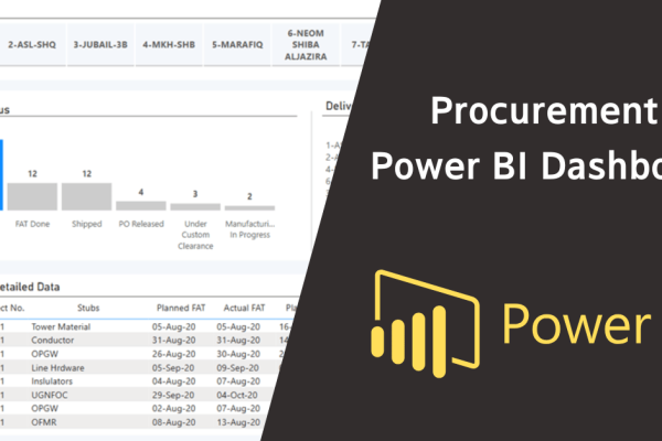
- Procurement Power BI Dashboard [Multi-Project Power BI Dashboard]
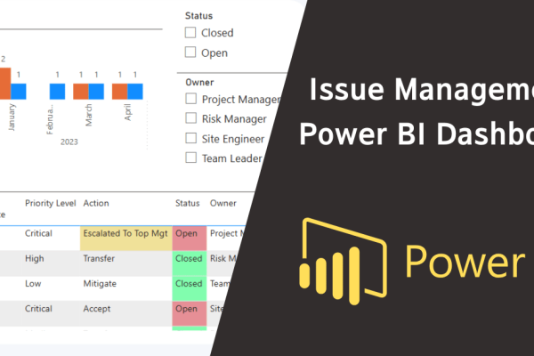
- Issue Management Power BI Dashboard [Multi-Project Power BI Dashboard]
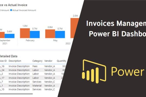
- Invoices Management Power BI Dashboard [Multi-Project Power BI Dashboard]
Download the Resources of this Article
A Tour of an Enterprise Power BI Dashboard [Article] 856.34 KB 464 downloads

Keep in Touch
Join our Email Newsletters and receive FREE weekly useful content!

Keep growing with Planning Engineer
Learn with a clear path
From Primavera P6 basics to claims, cost control and Power BI. Start with our free courses.
Browse coursesGet help on WhatsApp
Every course comes with a private WhatsApp support group where our team answers your questions.
Join a courseFind planning jobs
25 open planning and project control jobs. Post your resume so employers can find you.
See jobsGet tips by email
Free planning tips, templates and course offers. Unsubscribe any time.
Related posts:
 Understanding Merge Hotspot, Diverge Hotspot, and Logic Hotspot in Project Scheduling
  Solutions for the Error Message While Importing an Excel Sheet to P6
  How to connect Primavera P6 to Power BI (Full Guide)
  How to Edit the Activity name to include the Floor in 3 methods
  How to Create a Simple Power BI Report
You may also like
Leave A Reply
You must be logged in to post a comment.
1 Comment
nice